|
Learning to Quilt |
|
Lesson Six -- A Beginner's Color Study |
|
|
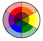
Starting with a brush up on some of the most very basics, here you see a Color Wheel. The three primary colors are Red, Yellow and Blue. Primary colors cannot be made from other colors... |

|
|
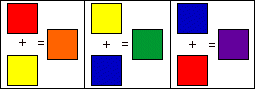
When you combine the Primary Colors, you get Secondary Colors: Orange, Green and Violet... |
|
|
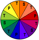
When you mix a Primary Color, and a Secondary Color together, you get Tertiary Colors: orange red, yellow orange, yellow green, blue green, blue violet and red violet..... and this goes on and on as you mix primaries, secondaries and tertiaries in various combinations... |
|
|
When you add black to a color
you make SHADES, and when you add white to a color, you make
TINTS...and now, let's see how this all relates to fabrics!
Colors opposite each other on the color wheel, generally work well together! |
|
|
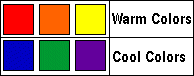
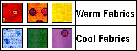
Colors evoke feelings...reds have a warm feel, blues have a cool feel.... |
|
|
and the same is true with fabrics... |
|
Stop and think for a sec here....fire, sun, hearts, roses...and other things in the red family, evoke physical and emotional warm fuzzies, while ice, water, green shade trees, and other blue family things evoke cool feelings. So, following through with that thought, it is likely that if you were doing a "Sunny Quilt"...it would have reds/yellows /oranges, whereas, if you were doing an Ice Mountain Quilt", it would likely be blues, purples, etc.! See?
|
 |
Note also that the eye-to-brain function processes color combinations differently, as shown at left with primaries and/or secondaries right next to each other... |
|
...compared to the same colors separated by black, which enables your eye to catch on to the changes more easily... |

|
Now, keeping all of that in mind, let's move on to picking fabrics, and some general rules of thumb...according to Marcia, that is :o) |
There is a general
"rule" about picking fabrics that tells us to pick a
focus fabric first, and to draw from that the other fabrics to
be used. When picking the others, try to choose a variety of
differently scaled prints, so that you wind up with some small,
medium and large scale in your quilt...and some contrast.
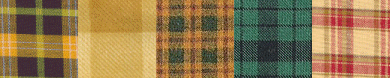
Working with that standard, as an example, you might choose a focus
floral, like this:
|


|
Now is the time to tell you that I don't work with many rules in mind...I work with feelings, which makes this very hard to explain! I start with a block pattern and a pattern name, and think about those...do they evoke any particular feelings? Warmth? Coolness? Spontaneity? Sharpness? Contemporary-ness? Antique-ness? What colors do I "picture" that block in?? This isn't difficult...just use free association! Example...the pattern Rocky Road to Dublin ...well that was almost a no-brainer...greens! Next I thought about Ireland, and images came to mind of rolling green hills, with sunlight and shadows, pubs, and farms and friendly folks!...so then I auditioned fabrics that gave me those same feelings! (Before the advent of the computer, I used reams of graph paper and oodles of colored pencils) |
| That's the way that I work....but others may work from the fabric to the pattern instead. You see a fabric in a store that just JUMPS into your cart...you know those? Now...what to actually DO with it?? This is when the above rules are helpful! Pull colors from your focus fabric, and go from there! Walk the quilting fabric isles at a quilt shop and hold that focus fabric up against the bolts...some will say YES!..Others will say NO! Pull the bolts out from the wall and stack them so you can see them all together! (and please...put them BACK!) Note** if you don't LOVE your choices...you are going to love them even less when you start sewing with them. Don't buy it if it isn't right! (Now that's a rule I do follow!) |
|
...BUT MARCIA!....What's RIGHT???
|
|
You're going to hate this answer! What's right, is what is right for YOU! If you love wild and crazy fabrics...those are right for you! If you love olive green...that's your color! The more you work with fabrics that elate you, the more inspired your quilts can be! You'll find, I believe, that the more quilts you do...the more your tastes will evolve with you. I believe that each person has to pick their own fabrics...this isn't something this page, or this person, or any other person can do for you...it's got to come from within! |
|
There are some tips that will help beginners though...the above mentioned rules, or picking fabrics that will blend or match with the colors in a specific room in your house, or picking fabrics very similar to ones you have seen in other quilts you liked...those are good starting points for beginners...from there...get brave! :o) |
|
|
|